Pie Factory Studios exhibition

A busy autumn period for me culminated in a group exhibition at the Pie Factory, Margate. Though a mere pop-downstairs from the studio, I had managed to volunteer myself to curate the exhibition—I had never done this before.

It is an interesting space, consisting of four unique, joined rooms, each with its own distinct personality. Some walls are flat, painted white, others have original tiling from when the building was a pie factory, while another is raw, crumbling brickwork.

I had no real idea how many or what kind of works would be arranged on those walls until the first morning of the hang. Everything from table mats and posters, to large paintings, to illuminated glass sculpture, had to be arranged into the four rooms with some logical, flow.

I expected some battling with artists, fighting with hanging systems, and a great deal of changing things around until they came together in a form that felt right. In a great part due to the lovely artists involved, It was a far less stressful experience that I expected.

The unique arrangement of rooms at the Pie Factory are a bonus in arranging and grouping the widely contrasting works into some logical order. I thought maybe to theme each space, but that proved impossible due to the diversity of the works. But each room had a distinct feel, and none of the works felt crowded or out of place. Guests appeared to enjoy their visits, and the artists seemed happy with my curation. Phew!

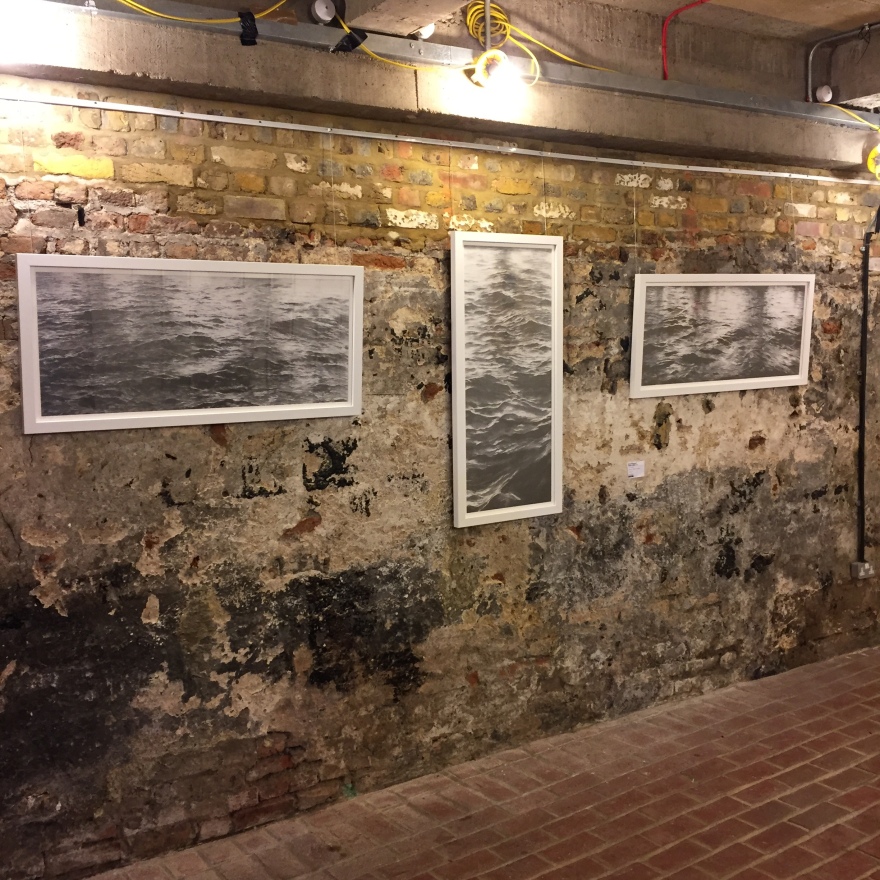
Hindsight brings some reconsideration of some of the hanging decisions, but so minor I doubt anyone would notice. It will be interesting if I am able to do this again next year. The experience gave me a fresh respect for curators, and I want to do more.

Artists who took part:

Neil Dixon, Jenny Duff, Don Eachells, David Mulett, Francesca Souza, Sweet Potato & Friends, Graham Ward, Helen Whitehead, Claire Youngs.

Comforting diversions

It’s a busy Autumn. November sees a group exhibition of The Pie Factory Artists, late October is The Pie Factory Margate open studios (in a few days), and we’ve recently ended the SGFA’s annual open exhibition DRAW18 in London. Other work is also heating up.

Aimless creative play is vital, particularly when most of my time, creatively or otherwise, is spent in long-session, detailed and intensive focused work. With a couple of large, detailed, intensive artworks completed, I thought it time to play a little: ease the pressure, enjoy the process for no other reason than the hell of it.

Drawing for the sake of it is freeing, yet difficult to justify in a buy world that demands every waking moment is functional and earning. More affirming activities take a back seat too often: it’s a daily battle for me.

A few fun images was the result of hours of “just doing it” (and a few pieces of paper in the recycling bin). I think I need to actively schedule some of this time into my week. It was fun.

Non-toxic oil painting

I have given oil painting a wide berth for many years. The last time I tried, solve fumes had me suffering sinus and upper respiratory inflammation for a couple of weeks. Plus, I loathe the smell of linseed oil.

Some work plans dictated the need to use slow-drying paints. So I recently played with Golden Open acrylics, which are quite wonderful, but still will not give me the kind of longevity I need, particularly for larger works.

There are several options to solvent-free oil painting now: Citrus-based cleaners and other thinners, strict use of oil over solvents for cleaning. But none of these also solve my revulsion to linseed oil?

IMG_3995Research led me to M.Graham oil paints. These are high-quality, artist paints, created with walnut oil – very stable and less yellowing than linseed, particularly with whites and blues. It is easy to clean brushes in pure walnut oil, and apparently, there’s barely any smell.

A sample pack arrived in the post last week and I’m delighted to report that there is almost no discernible scent at all, neither in the paints nor the pure oil itself.

IMG_3996.jpg

The set features primary colours, plus titanium white, and a bottle each of walnut oil and alkyd medium (for thinning and reducing doing time). It’s refreshing to see a sample pack that is fully usable, not merely a few odd colours to try out. Interestingly they are now explicitly marketing M. Graham oils as a solvent-free alternative to traditional oil paints.

More about how I get on with these once I’ve had a proper play with them, but right now, I’m thoroughly optimistic.

Another one done

Another solo exhibition is done, works are either off to new homes or once again wrapped in storage. Its a strange feeling.

If you have ever put together a solo event, you’ll have some idea of how much effort is involved in making it happen. Most artists will appreciate how much we put into what sometimes appears to be just a matter of sticking a bunch of works up on a wall. It is deceptively straightforward.

This year’s show at Ramsgate’s York Street Gallery was well received, and, thankfully, some sales. I am already thinking about something special for next year.

The current post-exhibition breathing space offers low-pressure creative time. In place of planned, structured, deadline work, the studio schedule consists of random experiments and playtime with different and new materials. There’s usually so little time for such no-pressure playtime.

Drawings by the sea

Much of my past work involves many hours of meticulous drawing. Every stroke of the pencil considered, controlled, directed. An interesting exercise might be to to give up that control.

The Tide Drawings are controlled by the sea itself. Video or time-lapse recordings are taken of tide movement. Each is projected as a still onto a sheet of paper, and the frontmost edge of the water at that moment marked as a simple pencil line.

Uninteresting results are common! The most effective include man-made or natural shoreline features, that form negative-space within the marks directed by the tidal flows.

There remains a slice of artistic influence in the execution of the pencil line, and small decisions made where the leading edge of water was ambiguous in the image.

I aim to extend the scope of such drawings, capturing an entire section of coastline during the full transition of the tide, for example. I will need a high vantage point that can be maintained for 4-6 hours or more. This coastline’s white cliffs might prove useful there.

Two Tide Drawings form part of the current exhibition at the York Street Gallery, Ramsgate until 9 May 2018.

Return to York Street

I’m delighted to have another solo exhibition at Ramsgate’s York Street Gallery, form 2-9 May 2018.

promo-card-landscape

This year my focus has been on The Isle of Thanet’s shoreline borders, the white cliffs in particular.

Paddleboarding at Pegwell

While paddle-boarding around the coast here, I was struck not by the cliffs themselves, but how they affect the colour, light, and structure of the sea at their feet. The white cliffs are a common feature for local artists, but could images be created that feature them, without showing them?

The main drawings in this year’s exhibition do just that. They feature not only the reflections of the cliffs, but the expressive nature of the works echo the movements of the water experienced while paddle-boarding there.

Paddle-boarding forms a minimalist platform on which one stands to paddle. The experience of every movement of the water is acute, particularly when tides are driving waves towards the cliffs which are reflecting them back to the sea. Particularly complex wave and tidal flows run through these waters making it a unique experience on the water.

One act many ripples

Like many I find myself becoming more politically minded as I get older, and in current times it’s tough not to be.

I want to reflect that refreshed awareness in some way in my art. My lack of formal art training, and two decades focused elsewhere, have left me without the visual vocabulary to express such ideas right now. But there’s also something more deeply rooted at work here.

I remember a school art project to create a poster for the 1980 Summer Olympic Games in Moscow. I don’t recall the exact nature of the brief, but I chose to create a very graphic silkscreened image of the Olympic Rings, the central upper ring forming the front of a Russian tank’s main gun, leading back and down to a silhouette of the tank itself. I printed a variety of colour options on different coloured papers. It was strong, direct, and very satisfying.

Amongst the other posters of athletes, logos, and others I cannot recall, mine appeared very much out of place. The teachers graded it low, and tried to avoid drawing attention to it, discussing briefly with frowns and clear discomfort. Everything about the way they treated that particular work demonstrated that statements and standing out from the rest was wrong.

That opinion hit this impressionable and insecure 15-year-old at just the wrong moment. Only in this time of reigniting my visual creative work have I understood the lingering inhibiting affect this has had.

Don’t listen to them, kids. When you have something to say visually, say it, loud and clear and proud, and don’t let the naysayers knock you off course.

Featured image: By Derzsi Elekes Andor CC BY-SA 3.0, from Wikimedia Commons